 Paul's
Web Design Pages issue 132 (October 97)
Paul's
Web Design Pages issue 132 (October 97)
Paul's
Web Design Pages issue 132 (October 97)
Publish and be... ... a picture editor!
 The big advantage of digitised images is that you can edit them, with effects ranging from simple cropping to detailed retouching. This is what professional photographers and picture editors have always done. Adobe Photoshop is the full-price PC image editing market leader, but my favourite, the amazing Paint Shop Pro, does almost everything the premium products do, does it exceptionally well, is easy to use and comes as shareware.
Here are some tips on how to use Paint Shop Pro 4 to make the most of your Web images. Most other image editors support the same techniques. One pre-tips tip - always work on a copy of your original image, then if you go wrong you can just throw it away and start again. I make a copy at each completed editing stage, so I only lose the latest failure, not the earlier successes. Another pre-tips tip - in Paint Shop Pro, some of the editing options, such as the Sharpen filter and Resample (a better alternative to Resize) only work with 16 million clour images. That's fine for JPGs, but is you're working with a 256-colour GIF, just increase its colour depth (Colors.. Increase color depth), do the edit, then decrease the color depth (Colors.. Decrease...) again.
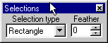 Cropping is easy in Paint Shop Pro - just use the select tool
 ![]() to create a selection area (make sure 'feather' is set to zero in the style bar <SELBOX.GIF>), then copy it to the clipboard (Ctrl-C) and paste it back in as a new image (Ctrl-V).
to create a selection area (make sure 'feather' is set to zero in the style bar <SELBOX.GIF>), then copy it to the clipboard (Ctrl-C) and paste it back in as a new image (Ctrl-V).
For basic composition, two layouts work well.
 For small images with a single subject, a 'bullseye' layout, with the subject horizontally and vertically centred, gives straightforward impact.
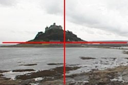
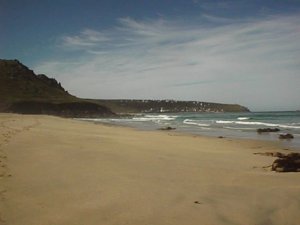
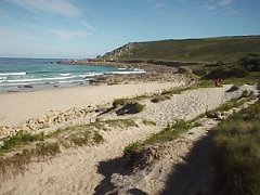
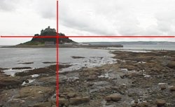 For bigger images and more complex compositions, try the 'rule of thirds' - placing the main subject roughly a third of the way in from either of the horizontal and vertical edges. For landscapes the horizon will normally be near the upper third, unless you're going for the 'big sky' look. Both these shots were cropped from the same original.
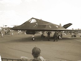
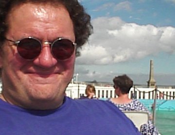 Don't be afraid to crop bits of people's heads off in close-up shots.
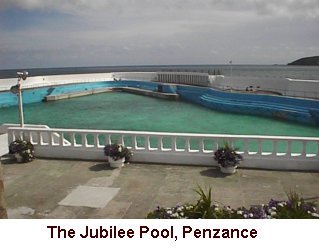
It gives a tightly-focussed effect, and picture editors and TV cameramen do it all the time. Tight cropping is especially useful on the Web, where excess pixels mean extra download time - just show the important facial detail. Who is that strange man by the poolside?
 Remember - you choose the aspect ratio.
You can use cropping to produce tall thin images, short, wide 'cinemascope' pictures, dead-square images or whatever else best suits the subject matter.
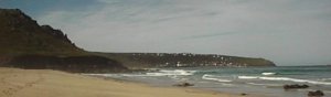
It really can make a difference - this cropped shoreline shot has the same horizontal detail as the original, but presents a more 'sweeping' image which emphasises the length of the peninsula.
 Borders gives pictures a classy, 'art-house' look.
To add a border to an image in Paint Shop Pro, choose Image..Add Borders.
 There's no need to wait for Dynamic HTML to make caption text remain anchored to your pictures - just add it to the picture itself.
In PSP, choose Image..Enlarge canvas, add a generous amount of height to the image (making sure to uncheck 'Center Image'), then add the caption using the text ('A') tool. Trim off any excess height by selecting, cutting and pasting as a new image.
 You can also add text to the picture itself, as in this special Group Efforts souvenir postcard.
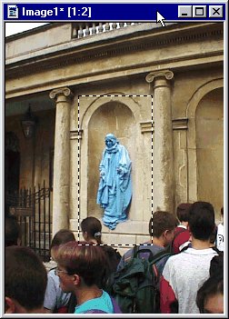 The camera never lies - or does it?
The blue man is a bit lost in the middle of this picture, so I crop him out in Paint Shop Pro by selecting an area around him, copying it to the clipboard, and pasting it back into PSP as a new, smaller image.
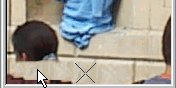 These people's heads are in the way, so I edit them out. I'm using PSP's clone brush to pick up pixels from underneath the cross-hairs (right) and copying them to the brush (left) as I move it over the image.
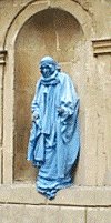 The result is a 'close-up' of the blue man standing on a stone ledge with not a passer-by in sight. I've also applied PSP's Sharpen filter to the image, to give a crisper look.
 This picture's nice enough, but with a quick application of Colors..Grey Scale in PSP it becomes a moody, retro shot (below) just perfect for creating that 1930s atmosphere. Note - this is the picture that should have been printed in the right-hand margin of page 263 of PC Plus.
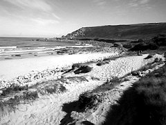
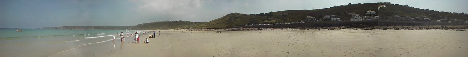
This is six images pasted together in PSP, with some retouching to try and hide the joins. (Use the scroll bar or right/left arrow keys to see the full width).
It won't fool anyone, but it's great fun to do, and does give an interesting perspective. I've shrunk the 3,000-pixel wide original to half size here, in the interests of download times! By the way, if you're wondering what the 'Hull Beach' caption to this picture on page 262 of PC Plus is all about - so am I! It was written in by our sub-editors, who presumably didn't have anything better to do that day.
Words and images all (c) Paul Stephens 1997.
All the pictures on this page were taken with a Sony DSC-F1 digital camera, and edited using Paint Shop Pro 4.0.